Mini Cart
Free Shipping in the Continental US and Parts of Canada. 

EuroLux Home
Exploring Antique Furniture and Home Decorating Ideas
1920s Bungalow Renovation Antique Clocks Antique Furniture Restoration Antique Furniture Styles Antique Reproduction Furniture Antiques Buying Trip Client Spotlight Food & Entertaining

Paint Color Trends: Coral and Clay

 Every year the paint and color trend companies release their ‘Colors of the Year’ and I've just been looking at the colors for 2019. Of course, the new colors chosen each year don't mean that we all want to redecorate and change our color scheme overnight! But they sometimes give me new inspiration, shaking up my ideas on how I could use different colors, either on my walls or as a decorative accent.
Paint Color Trends
Many of the paint Colors of the Year fall into a palette of coral and clay tones. Let's take a look at them, starting with Pantone's Living Coral color, a bold pinky orange.
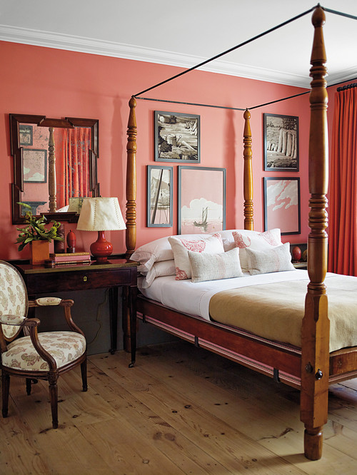
Here's the Living Coral color in a bedroom in New York. Pantone describes Living Coral as “An animating and life-affirming coral hue with a golden undertone that energizes and enlivens with a softer edge.” Certainly this bedroom looks cozy and inviting, and the warm coral color goes well with the traditional decor and wood furniture.
 Earthen Trail is Pratt & Lambert's color of the year. The soft terracotta is quite similar in nature to the Pantone shade.
Both of these colors, Earthen Trail and Living Coral, have a sun-kissed quality to them that make them quite cheerful colors.
Strong Paint Colors
If they are too strong to use on every wall in a room, you can think about using them on feature walls, architectural features, doors, or as outside colors on your patio or deck.
Or choose accent pieces in furniture and home decor, like this gorgeous Trade Winds coral wall mirror, with a painted mahogany frame.
 Sherwin-Williams has also chosen a warm terracotta for its color of the year in 2019, and they call it Cavern Clay. This moody brown evokes the desert Southwest and has an earthiness that can look either refined or casual.
More Paint Color Trends
Cavern Clay in the dining room makes a great color that offers more oomph and warmth than a lighter neutral like white or gray, but is still subtle and sophisticated to create a backdrop for elegant dinner parties!
Spice of Life by Dunn-Edwards continues the earthy warm tones that have been chosen as colors of the year, and this is the boldest of the bunch!

Spice of Life is a vibrant fire brick red / brown with orange undertones. "Spice of Life is an outgoing, confident hue that adds drama and stimulates the senses,” according to Dunn-Edwards. Traditional interiors will make the most of this intense color when teaming it with khaki tones, deep blue or cream. For a more contemporary look, pair it with crisp white, cool grays and black.
In my next post, I'll look at some of the cooler blue, green and gray tones popular right now. But till then, what do you think of these coral and 2019 colors of the year?

Aimee owns EuroLuxHome.com with her husband and best friend, Greg. With over 20 years' experience in acquiring and selling French Antique Furniture, she is very knowledgeable about furniture styles and how they are influenced by historical events. Aimee has shipped antique furniture and antique furniture reproductions to all 50 States and over 50 foreign countries. Subscribe to this blog for articles about antique furniture construction methods, style trends and even repair tips. Check out our YouTube channel!
Recommended Posts
-
Why We Love Renaissance Style Furniture
The Renaissance era had such a deep impact that even hundreds of years later, craftsmen were still trying to emulate its accomplishments. This furniture style became popular again in 19th century France. The antique Renaissance style furniture that we sell today is from this Revival period, dating to the late 19th and early 20th-century. This is the same era as...
Read On -
Antique Beds: 4 Things to Know
More time is spent in the bedroom than any room in the home. The mood of the room sets the tone of your day when you wake up, and lets you unwind as you go to sleep. With that in mind, it's important to go all-out on this space's decor! Purchasing an antique bed is an investment to say the...
Read On -
Clocks for the Home
Without superb wall decor in all of the primary living rooms and bedrooms, a house isn't a house. A high-quality timepiece on your nightstand or a desktop clock in your home office can elevate your interior design. It's just not the same telling the time on your phone! New, vintage, and antique clocks in traditional styles provide character and a...
Read On