Mini Cart
Free Shipping in the Continental US and Parts of Canada. 
EuroLux Home
Exploring Antique Furniture and Home Decorating Ideas
1920s Bungalow Renovation Antique Clocks Antique Furniture Restoration Antique Furniture Styles Antique Reproduction Furniture Antiques Buying Trip Client Spotlight Food & Entertaining

Paint Color Decor Trends 2017: Purple Reigns!

While 2016's paint color trends were all about the whites, for 2017 many of the big paint companies have declared that purple reigns! Don't worry, these aren't vivid purples that would look more at home in a 1970's nightclub. These are soft, moody and muted tones that are restful on the eye. While nobody is going to redecorate just because of a new year of color trends, we always enjoy seeing the color picks and how they might enliven our own decor, even in just as a few accent details. Benjamin Moore nominated Shadow as its 2017 Color of the Year. This is the most intense purple of all the paint companies and they call it "a rich, royal amethyst" but it looks to me as if it still has lots of gray in it. The white lifts it and I think it needs a little bling too -- gold or silver accessories or some sparkling crystal. Here you see a crystal chandelier and a gilt framed mirror. Benjamin Moore describes Shadow as, "A master of ambiance...sophisticated, provocative and poetic."

Glidden paint named Byzantine Blue as its 2017 Color of the Year. The company says: "The name may say blue, but Byzantine Blue is truly a purple in disguise." I do wonder why they called it blue in the first place, then... all these paint colors are confusing enough as it is! Anyway, it looks very elegant in this hallway. Quite serene and classic but bringing a nice dose of color. This purple definitely brings in blue and gray tones, so the look will change according to the colors you pair it with.

PPG Pittsburgh Paints added to the passion for purple with its selection of Violet Verbena as 2017 color of the year. Another gray-purple hue, Violet Verbena would look good in a traditional space like this beautiful bedroom. PPG describes it as a "nuanced update on a classic shade" and I agree with them that it will blends a masculine and feminine note. This makes it a good choice for a guest bedroom. It will appeal to both male and female visitors. But whoever is sleeping there, I suggest they move the bedside table next to the bed! 
Olympic Paints & Stains named Cloudberry as its 2017 Color of the Year, and this one looks the most obviously purple of them all, as far as I can tell from the photos. This soft violet seems the most feminine of all the purples, making it a sweet tone for a lady's boudoir or dressing room, or for a powder room. But paint hues always change according to the colors they are teamed with, and the pinks in this living room photo will certainly bring out the blush in the Cloudberry wall color. Paired with gray or white, the look would be quite different, and paired with black it would be very dramatic and seductive. I think this is a great color for someone with Hollywood Regency style decor!
Tell us in the comments box what you think of these colors. We'd love to hear about your own decorating plans for 2017.
If you are tempted to pick up some purple accessories or furniture for your home, find them at EuroLuxHome.com at this purple decor link.

Aimee owns EuroLuxHome.com with her husband and best friend, Greg. With over 20 years' experience in acquiring and selling French Antique Furniture, she is very knowledgeable about furniture styles and how they are influenced by historical events. Aimee has shipped antique furniture and antique furniture reproductions to all 50 States and over 50 foreign countries. Subscribe to this blog for articles about antique furniture construction methods, style trends and even repair tips. Check out our YouTube channel!
Recommended Posts
-
Why We Love Renaissance Style Furniture
The Renaissance era had such a deep impact that even hundreds of years later, craftsmen were still trying to emulate its accomplishments. This furniture style became popular again in 19th century France. The antique Renaissance style furniture that we sell today is from this Revival period, dating to the late 19th and early 20th-century. This is the same era as...
Read On -
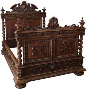
Antique Beds: 4 Things to Know
More time is spent in the bedroom than any room in the home. The mood of the room sets the tone of your day when you wake up, and lets you unwind as you go to sleep. With that in mind, it's important to go all-out on this space's decor! Purchasing an antique bed is an investment to say the...
Read On -
Clocks for the Home
Without superb wall decor in all of the primary living rooms and bedrooms, a house isn't a house. A high-quality timepiece on your nightstand or a desktop clock in your home office can elevate your interior design. It's just not the same telling the time on your phone! New, vintage, and antique clocks in traditional styles provide character and a...
Read On